DW Flyers
|
*sam* Posted Aug 30, 2008, 11:37 am |
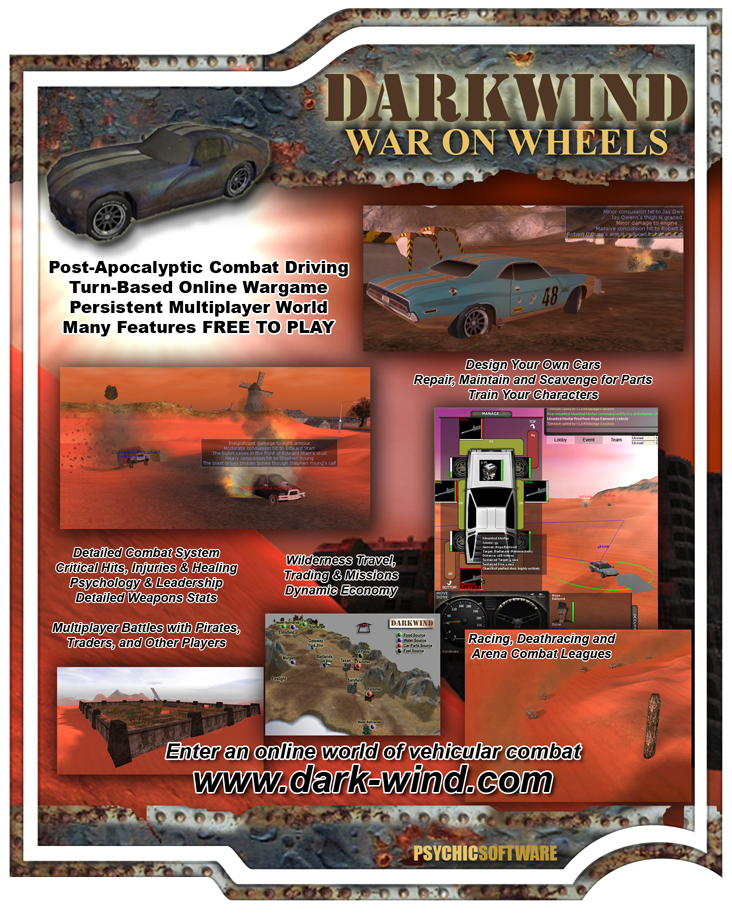
A couple of people have asked about DW flyers for distributing at conferences etc. I really appreciate anyone who is willing to do this, and I made the following a year or so ago:
EDIT: old version removed [Current version of Flyer here] |
||||
|
4saken Posted Aug 30, 2008, 2:42 pm |
would have been cool if this had come out just a little earlier. dragoncon is in town this weekend. i almost went but i am poor, lazy, and the lines to get in are like 1000 people long. | ||||
|
Hula Posted Sep 2, 2008, 7:55 pm |
well I'm going to a games con in leeds in october - so will drop some off there again... |
||||
|
*sam* Posted Mar 2, 2009, 4:44 pm |
Banners:
http://www.dark-wind.com/images/banner_gameogre468x60.gif: 
http://www.dark-wind.com/images/banner-rpg.net-468x60.jpg 
|
||||
|
Karz Master Posted Sep 26, 2009, 6:16 pm |
I hope you appreciate my continuous, non-stop, heart-pounding spamming of the forums I frequent with these Darkwind flyers |
||||
|
*Ayjona* Posted Sep 26, 2009, 7:44 pm |
I was actually just about to ask for a banner. This one is going directly into my signatures in the very few other games forums I frequent!
EDIT: I wouldn't mind a more high-resolute version of the jpg banner, though. For extra impact |
||||
|
Thin Izzy Posted Jan 20, 2010, 4:50 am |
When I first read the title I thought perhaps you were talkin' of adding primitive aircraft to the game... d'oh! | ||||
|
Zephyr Posted Jan 20, 2010, 9:12 am |
Me too... I got all excited, thinking you were adding flying vehicles to the game. I had visions of that little gyrocopter from the Road Warrior movie. |
||||
|
*sam* Posted Jan 20, 2010, 9:24 am |
One day I will! | ||||
|
Togakure Posted Feb 14, 2010, 8:45 pm |
Couple questions:
Can you update the flyer with newer images? The vehicle management image looks outdated. And any new design ideas that can mention the factions patch? I really enjoy the new update, and think it would add a little more interest to the flyers. |
||||
|
*Grograt* gary.r.horder@gmail.com Posted Feb 14, 2010, 8:47 pm |
Hopefully for Salute |
||||
|
*sam* Posted Feb 14, 2010, 8:48 pm |
I'm going to rework the flyers - new images, yes, plus it really should have some mention of the reviews in places like PC Gamer. I'll probably bring some along to the Salute event in April. | ||||
|
*Dark Tempest* Posted Mar 11, 2010, 3:36 am |
How are those reworked fliers coming along? | ||||
|
Jake Nikodemus Posted Apr 2, 2010, 4:44 pm |
I'll put out some flyers. Won't even bill you for the ink! I missed Garycon this year, but I can visit a few local specialty shops and get some posters up. | ||||
|
*sam* Posted Apr 12, 2010, 7:52 pm |
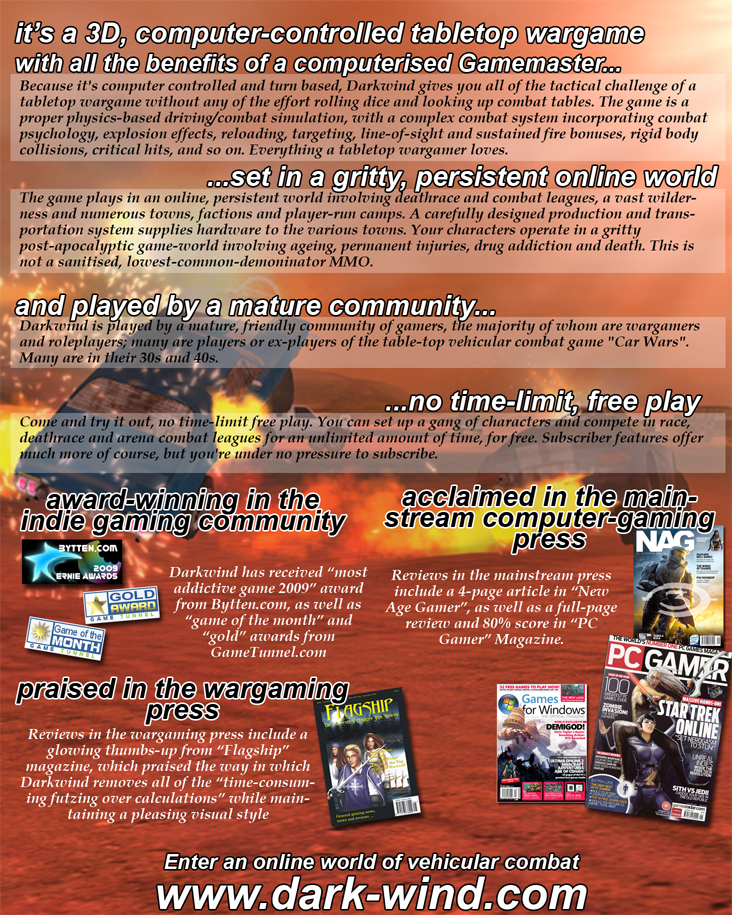
Here's a draft version of an updated flyer that I have been working on for the Salute convention. This is targeted at Wargamers..
Front: 
Back: 
|
||||
|
*Ninesticks* Posted Apr 12, 2010, 7:57 pm |
Pretty much spot on I would say Sam. | ||||
|
*sam* Posted Apr 12, 2010, 8:06 pm |
Thanks! I noticed a typo on the 2nd page, and actually a couple of more exciting looking images on the 1st page might be a good idea.. | ||||
|
*goat starer* Posted Apr 12, 2010, 8:42 pm |
are you sure the whole community is mature?
gro is way older than mature ff has never been mature |
||||
|
*sam* Posted Apr 12, 2010, 8:43 pm |
I never said every member was mature, just the community as a whole |
||||
|
*Burden* Posted Apr 12, 2010, 9:08 pm |
The age being set at 20-40 would work pretty swell, I dare say. It wouldn't scare away the people like me, Rez, TheEvilChaos, and other young adults. |
||||
|
*sam* Posted Apr 12, 2010, 9:11 pm |
Well, 20-50 then maybe..
Again, I wasn't saying everyone was 30s/40s, just that an unusually high percentage were. |
||||
|
*Grograt* gary.r.horder@gmail.com Posted Apr 12, 2010, 9:28 pm |
And yet again the over 45's are washed up before they even get a chance |
||||
|
*sam* Posted Apr 12, 2010, 9:49 pm |
edit: I meant 30s/40s, not 30-40 |
||||
|
*sam* Posted Apr 12, 2010, 9:54 pm |
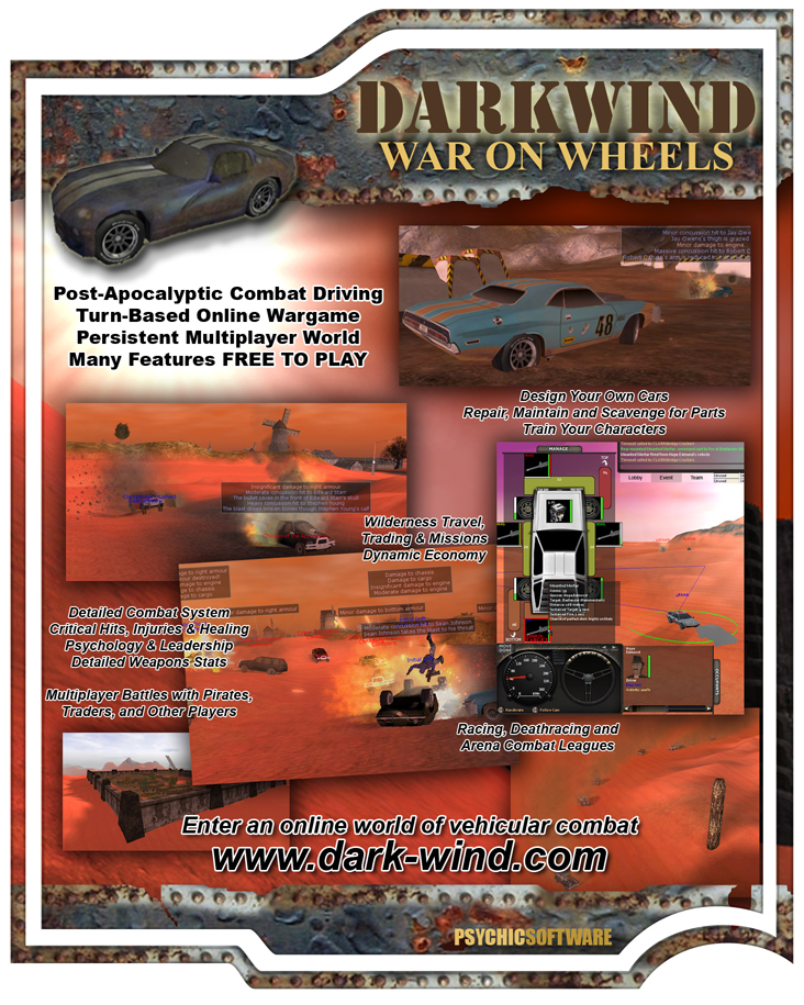
Anyway, here's an updated 1st page:

|
||||
|
Serephe Posted Apr 12, 2010, 10:06 pm |
Multiplayer battles with pirates, traders and sometimes Serephe. |
||||
|
*sam* Posted Apr 12, 2010, 10:10 pm |
You know advertising is supposed to be aspirational, right? |
||||
|
*Grograt* gary.r.horder@gmail.com Posted Apr 12, 2010, 10:13 pm |
Dont forget to mention the forum PVP |
||||
|
Marrkos Posted Apr 12, 2010, 11:08 pm |
You might want to put a little note that the design your own cars; repair, maintain, and scavenge for parts; and wilderness travel, trading and missions require a paid subscription.
Mostly because you specifically call out the fact that many features are free, so it's not a long jump to think the features being highlighted on the flyer fall under the 'free' banner. Perhaps an asterisk with a note at the bottom? Also, the Multiplayer Battles with Pirates, Traders, and Other Players bit sounds like there can be X on X on X battles which really isn't the case except in a few Arena events, right? Love the inclusion of the ped impact. |
||||
|
*jimmylogan* Posted Apr 12, 2010, 11:26 pm |
Same here ! That's the big thing that jumped out at me. |
||||
|
*Longo* Posted Apr 12, 2010, 11:30 pm |
Looks pretty cool! | ||||
|
Lord Foul Posted Apr 13, 2010, 3:22 am |
Does look good, only front pic I might change in the lower left one of Gateway.
A higher view version would stick out more and would show more of what a town looks like. The one there now looks like the corner of a building with some trees growing out of it. |
||||
|
*sam* Posted Apr 13, 2010, 10:43 am |
Thanks for the feedback guys.. you're right about the Gateway image LF, and in fact it should be layered in front of the central image.. maybe I'll put the BL image with Latte's trucks in instead, yeah..
RE central image - I always liked that one. One of our earliest ped tests, that character belonged to Diablo Vash and I ran him over at 50mph.. hehe. I'll have a think about the 'Free' wording too, thanks Marrkos.. |
||||
|
*goat starer* Posted Apr 13, 2010, 11:16 am |
why are there no fabulous goat skins on it?
|
||||
|
*sam* Posted Apr 13, 2010, 12:01 pm |
Limited space goat.. fitting in plenty of critical hits and GUIs seems most important for a wargaming audience.
Anyways.. see (final?) pdf here (6.78MB): flyer.pdf |
||||
|
*Marc5iver* marcgillespie55@gmail.com Posted Apr 13, 2010, 5:18 pm |
I see one grammatical error, need to add the word "of" in the first sentence on page 2,
without any of the effort OF rolling dice
Looks great though |
||||
|
*sam* Posted Apr 13, 2010, 6:05 pm |
Got it, thanks Marc. | ||||
|
FireFly Posted Apr 13, 2010, 6:37 pm |
I cant resist, have to ask about those screenshots, they must be pretty old, I've never seen the "Insignificant" damage message, and how in the world did you squeeze a mortar, 3.2l and 3mmg's in a mcfly? |
||||
|
*sam* Posted Apr 13, 2010, 7:07 pm |
Yep, that was removed as misleading probably 18 months or more ago.
LOL well spotted. That screenshot was actually taken on my offline test computer, which has lots of weirdnesses in its database.. basically I just swap stuff around whenever needed to test them. |
||||
|
Karz Master Posted Apr 13, 2010, 9:27 pm |
Sexy stuff Sam! | ||||
|
ISHOULDCOCO Posted Apr 13, 2010, 9:44 pm |
Know we know what Sam's ride is ! marked man !
(thx boss) COCO |
||||
|
Lord Foul Posted Apr 13, 2010, 11:52 pm |
Much better, though I would have replaced the top left car with the most legendary car in all of Evan that also has one of the best looking skins youll ever see. Yeah Im biased since its mine, but its still the truth. lol |
||||
|
*goat starer* Posted Apr 14, 2010, 10:45 am |
its number 158 on the 'best skins' list Foul |
||||
|
shotgunner20 Posted Dec 23, 2021, 4:11 pm |
I can't wait |